Cosmic Wings
Brand Positioning
Brand Strategy
Logo Development
Presentation Template
Applebee’s Challenge: Create an iconic yet fun wings brand
During the height of the COVID-19 pandemic, with dining rooms closed across the country, Applebee’s faced a significant challenge: how to continue serving their customers in an era of social distancing. In response, they conceived a bold new concept—a virtual kitchen dedicated to chicken wings, available exclusively through delivery. We worked with them to create the foundations for that brand.

Our Strategy: Creating a brand that’s out of this world
Our first task was to create a name for the new virtual restaurant. Over the course of two rounds, we explored countless names, ranging from the more-expected (e.g., Wing Junction) to the punny (e.g., Earth, Wings, & Fire), and just about everything in between. In the end, the choice was almost unanimous: Cosmic Wings. This name stood out against the competition, while also being fun, easy to message against, and a fitting springboard for design.
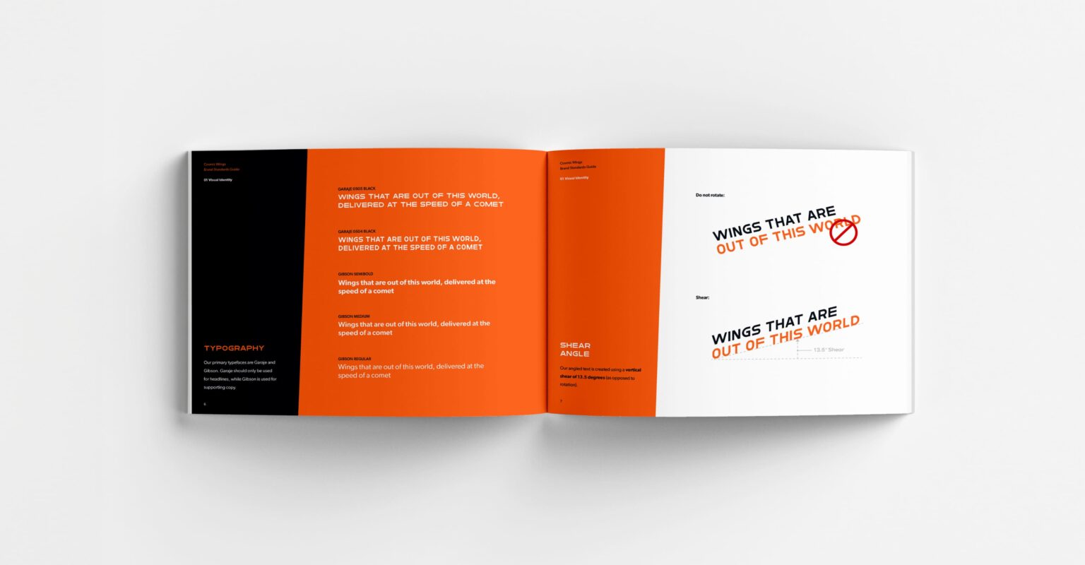
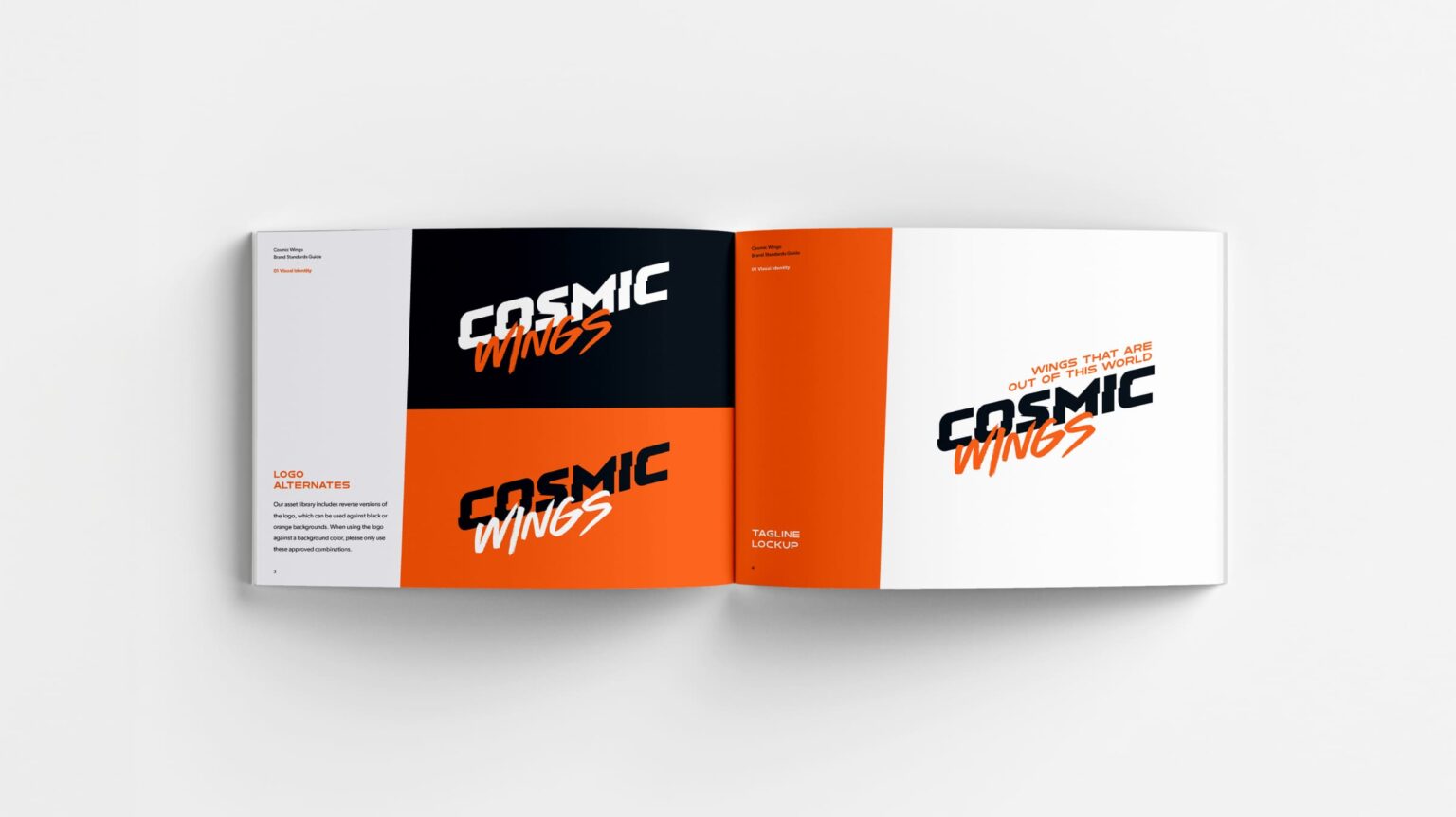
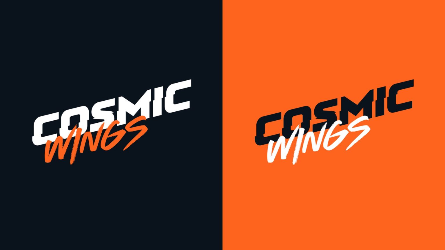
To that end, we then embarked on creating the brand’s look and feel. We explored multiple different symbols, wordmarks, and visual styles, ultimately deciding on something that combined a vintage, almost-80s feel with something more modern and dynamic.
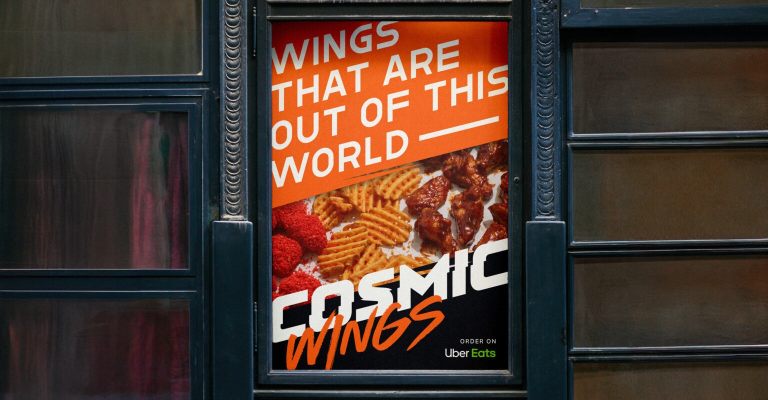
The Result: A Wing Brand That’s Out of This World
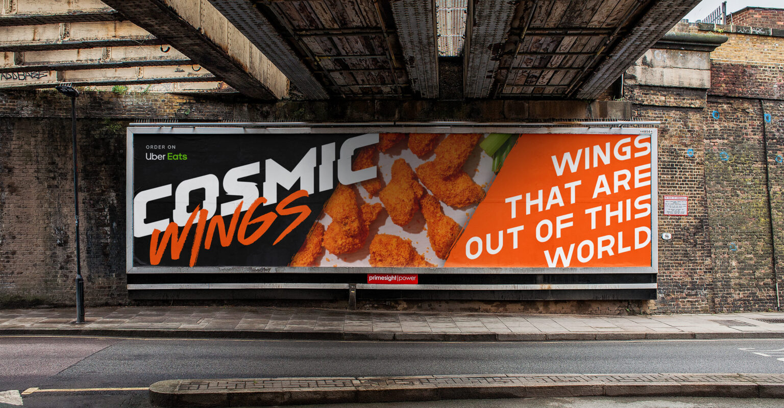
With Cosmic Wings officially launched, Applebee’s found a fun, memorable way to continue serving their customers despite the constraints of the pandemic. The combination of a bold, engaging name and a striking visual identity helped Cosmic Wings stand out in what would become a crowded virtual kitchen space. The brand’s retro-modern aesthetic and playful tone resonated with customers, creating excitement and loyalty for the new venture.

